


Charts are simply graphical representations of a series of prices over time. For example, a chart might show a stock’s price movement over a one-year period where each point represents an individual day’s closing price. Or, a chart might show a commodity’s price movement over a period of just one hour with each point representing one second. The common denominator is that price is typically on the Y-axis and time is usually on the X-axis.
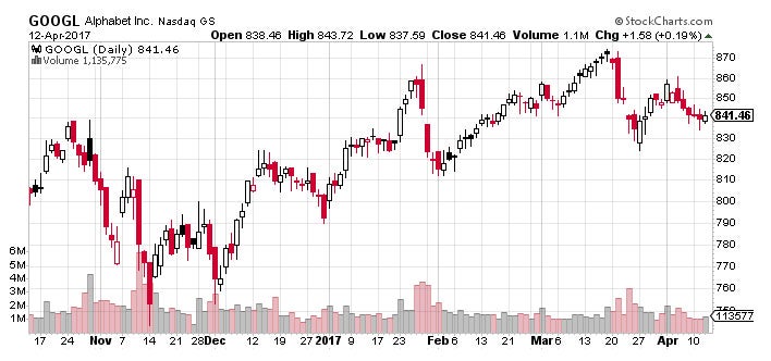
Figure 9 – Stock Chart Example – Source: StockCharts.com
Figure 9 shows an example of a basic stock chart for Alphabet Inc. (GOOGL). It’s a representation of the price movement of a stock over a roughly six-month period. The bottom of the chart, running horizontally (X-axis), is the date or time scale. On the right-hand side, running vertically (Y-axis), is the price of the security. This type of chart – known as a candlestick chart – shows the daily price range of a stock that’s represented by the length of each bar.
[ Charts are the most fundamental tool for technical analysts, similar to financial statements for fundamental analysts. If you're interested in learning more about technical analysis, check out Investopedia's Technical Analysis Course to learn basic and advanced technical analysis, chart reading skills, and technical indicators in over five hours of on-demand video, exercises, and interactive content. ]
Chart Properties
There are several things that investors should be aware of when looking at a chart, since these factors can affect the information that is provided. They include the time scale, price scale, and price point properties that are used in the creation of the chart.
Time Scale
The time scale refers to the range of dates that appear at the bottom of the chart, which can vary from seconds to decades. The most frequently used time scales are intraday, daily, weekly, monthly, quarterly, and yearly. Shorter timeframes are commonly used by day traders or investors looking for greater detail, although these smaller timeframes tend to have more ‘noise’ that can make trends harder to spot.
Intraday charts plot price movements over the course of a single day and are often used exclusively by day traders. Often times, the time scale of these charts is denominated in seconds or minutes to show maximum detail.
Daily charts are commonly used by traders and investors with each price point representing a single day. In line charts, each point represents the closing price for the day. In candlestick charts, such as Figure 9, each point represents the open, high, low, and close for the day. These data points can be spread out over weeks, months, or years to monitor both short-term and intermediate-term trends in price over time.
Weekly, monthly, quarterly, and yearly charts are used to analyze long-term trends in stock prices. Each data point in these graphics is a condensed version of what happened over a specified period. For example, a weekly chart’s data point represents the price movement over the course of an entire week or the closing price of the last trading day.
Price Scale and Price Point
The price scale appears on the right side of the chart and shows the stock’s price ranges. This may seem like a simple concept – in that prices move from lower to higher – but price scales can be either linear (arithmetic) or logarithmic in nature.
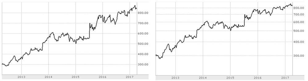
Figure 10 – Linear v. Logarithmic – Source: TD Ameritrade Charts
Linear price scales (Figure 10 – Left Side) have even spacing between each price point, which means that a price that moves from $10 to $20 is the same distance as a price that moves from $40 to $50. In other words, the price scale measures absolute moves and doesn’t show the effects of percentage changes in value over time.
Logarithmic scales (Figure 10 – Right Side) look at price movements in percentage terms, which means that the spacing between each point is equal to the percentage change. For instance, price change from $10 to $20 is 100% while a price change from $40 to $50 is only 25% even though the absolute difference is the same - $10. Logarithmic charts will show a smaller space between $40 and $50 than between $10 and $20 for this reason.
Many professionals use logarithmic charts because it’s easier to spot how large price movements are on a percentage basis, whereas linear charts can be a little distorted in fast moving markets.
Technical Analysis: Chart Types
-
 Trading
Analyzing Chart Patterns
Learn how to evaluate a stock with a few easy-to-identify chart patterns. -
 Trading
Multiple Time Frames Can Multiply Returns
Short-term and intermediate charts complement the underlying trend and refine entries and exits. -
Investing
Blending Technical and Fundamental Analysis
Find out how you can combine the best of both strategies to better understand the markets. -
 Trading
The Right Way to Set Up Your Trading Screens
Well-organized trading screens can speed up complex decision making.