


There are four primary types of charts used by investors and traders depending on the type of information they’re seeking and their desired goals. These chart types include line charts, bar charts, candlestick charts, and point and figure charts. In the following sections, we will focus on the S&P 500 over the same period to illustrate the differences between the charts when the underlying data set is the same.
Line Charts
Line charts are the most basic type of chart because it represents only the closing prices over a set period. The line is formed by connecting the closing prices for each period over the timeframe. While this type of chart doesn’t provide much insight into intraday price movements, many investors consider the closing price to be more important than the open, high, or low price within a given period. These charts also make it easier to spot trends since there’s less ‘noise’ happening compared to other chart types.
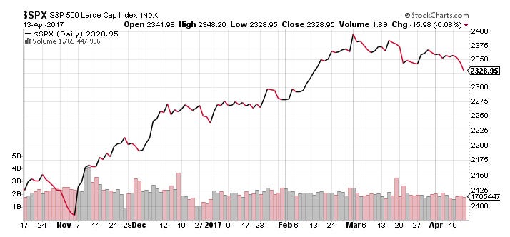
Figure 11 – Line Chart Example – Source: StockCharts.com
Bar Charts
Bar charts expand upon the line chart by adding the open, high, low, and close – or the daily price range, in other words – to the mix. The chart is made up of a series of vertical lines that represent the price range for a given period with a horizontal dash on each side that represents the open and closing prices. The opening price is the horizontal dash on the left side of the horizontal line and the closing price is located on the right side of the line. If the opening price is lower than the closing price, the line is often shaded black to represent a rising period. The opposite is true for a falling period, which is represented by a red shade.

Figure 12 – Bar Chart Example – Source: StockCharts.com
Candlestick Charts
Candlestick charts originated in Japan over 300 years ago, but have since become extremely popular among traders and investors. Like a bar chart, candlestick charts have a thin vertical line showing the price range for a given period that’s shaded different colors based on whether the stock ended higher or lower. The difference is a wider bar or rectangle that represents the difference between the opening and closing prices.
Falling periods will typically have a red or black candlestick body, while rising periods will have a white or clear candlestick body. Days where the open and closing prices are the same will not have any wide body or rectangle at all. (To read more, see The Art of Candlestick Charting – Part 1, Part 2, Part 3, and Part 4).
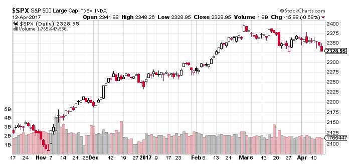
Figure 13 – Candlestick Chart Example – Source: StockCharts.com
Point and Figure Charts
Point and figure charts are not very well known or used by the average investor, but they have a long history of use dating back to the first technical traders. The chart reflects price movements without time or volume concerns, which helps remove noise – or insignificant price movements – that can distort a trader’s view of the overall trend. These charts also try to eliminate the skewing effect that time has on chart analysis. (For further reading, see Point and Figure Charting).

Figure 14 – Point and Figure Chart Example – Source: StockCharts.com
Point and figure charts are characterized by a series of Xs and Os. The Xs represent upward price trends and the Os represent downward price trends. There are also numbers and letters in the chart that represent months and given investors a rough idea of dates. Each box on the chart represents the price scale, which adjusts depending on the price of the stock: The higher the stock’s price the more each box represents. On most charts, a box represents $1 or 1 point.
Another key point to remember is that point and figure charts have reversal criteria that must be set by the technical analyst – although it’s usually set to three. The reversal criteria represents how much the price has to move away from the higher or low in the price to create a new trend, or in other words, how much the price has to move in order for a column of Xs to become a column of Os, or vice versa. When the price trend has moved from one trend to another, it shifts to the right, signaling a trend change.
Conclusion
Charts are the most fundamental aspect of technical analysis. It’s important for traders to understand what’s being shown on a chart and the information it provides. Now that we have a clear idea of how charts are constructed, we can move on to the different types of chart patterns.
Technical Analysis: Chart Patterns
-
 Trading
Is It A Breakout? See The Point-And-Figure Chart
These stocks have broken out of a triple top formation using point-and-figure charting, a bullish sign. -
 Trading
Heikin-Ashi: A Better Candlestick
A valuable tool in technical analysis, Heikin-ashi charts smooth out the price action, and with candlestick charts can make it easier to spot trends and reversals when trading. -
 Trading
Analyzing Chart Patterns
Learn how to evaluate a stock with a few easy-to-identify chart patterns. -
Trading
Multiple Time Frames Can Multiply Returns
Short-term and intermediate charts complement the underlying trend and refine entries and exits. -
 Trading
Trading Without Noise
False signals can drown out underlying trends. Find out how to tone them down and tune them out.